2016
Picfair: Six months at a fast moving startup
Designer, Full-Stack Developer
Picfair is a marketplace where professional and amateur photographers can licence out their photos. What makes Picfair different is that they have set out to open up a closed industry by championing a fair licensing model for both buyer and seller.
I was fortunate enough to be approached by them in late 2015 to work on a number of projects. I was the only designer at the time but also worked full-stack as a member of the engineering team.
We worked on everything from tweaking visuals to implementing a brand new server. Fixing bugs, performing code reviews and writing tests along the way.
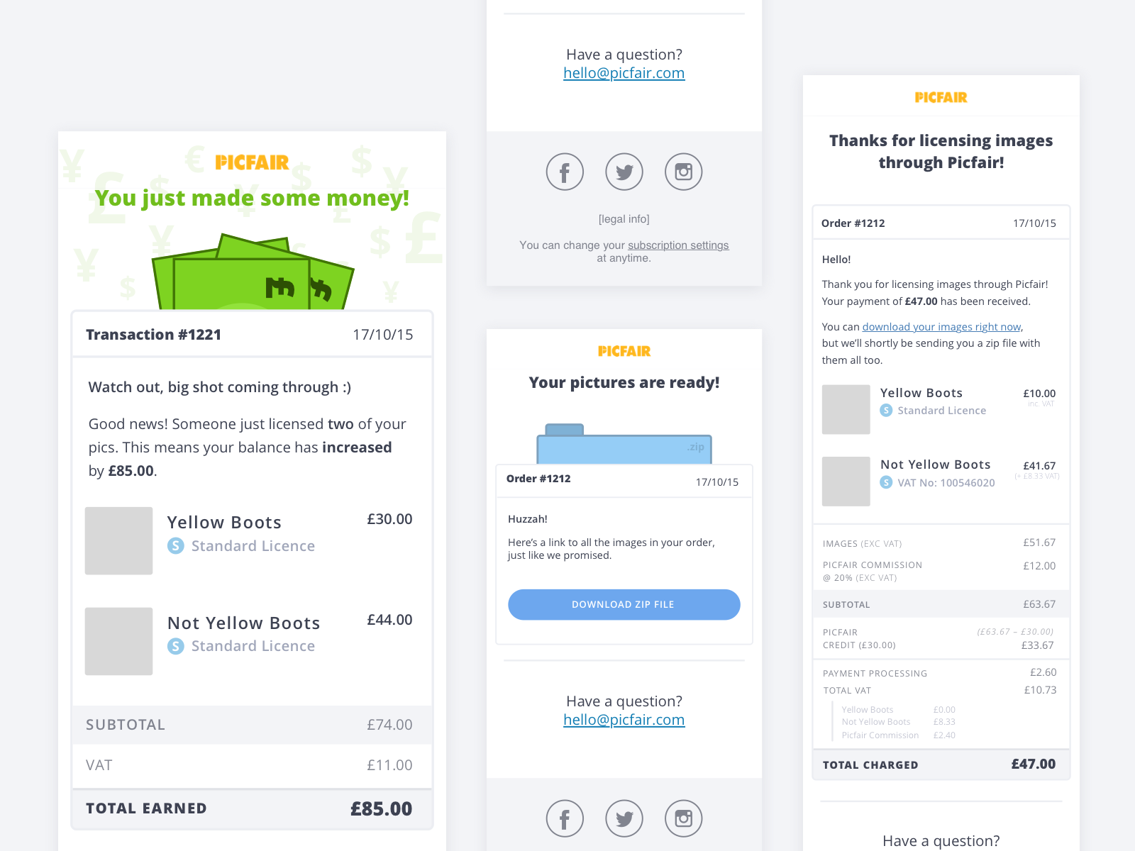
Email Mailers
One of my first tasks at Picfair was to design and build the emails that were sent every time an order was placed.
This included the buyer and seller invoice emails, as well as the email that is sent when the download link for an order is available.
Key Takeaways
Writing frontend code for emails is a lot harder than I thought it would be.
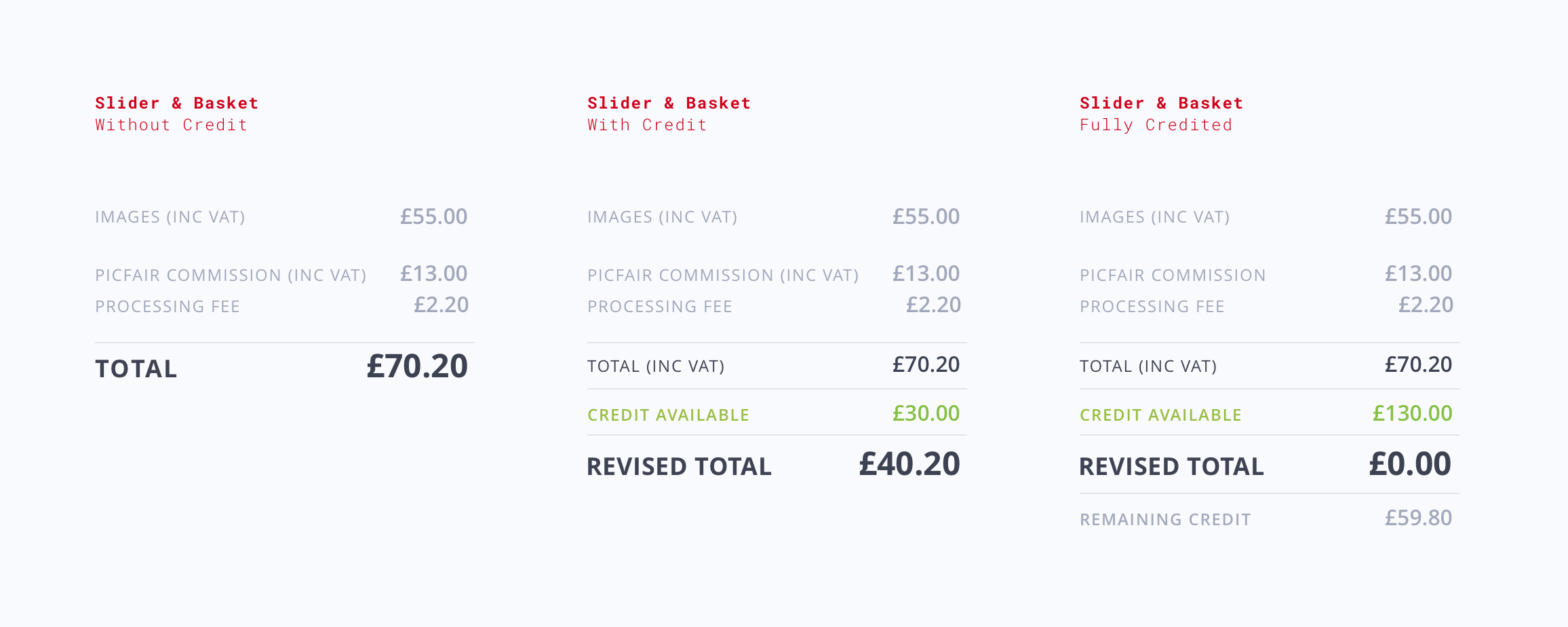
Basket and Checkout Tweaks
We later set out to fully integrate Picfair’s in-app currency into the website’s UI. To do this we designed how the shopping basket would look and how the checkout flow would change for customers in different states (with credit, without credit, etc).
Key Takeaways
I learned about the business and UX motivations around virtual currencies and a little bit about VAT too (yikes!).
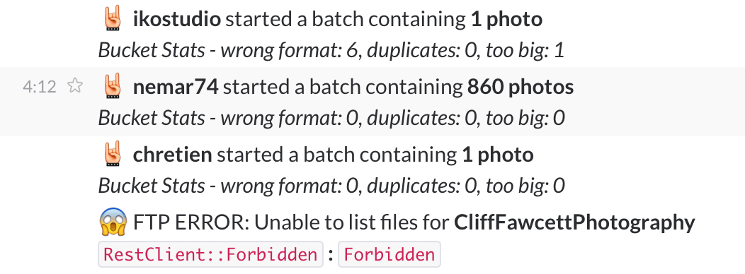
Improving Notifications
Like many teams the stats and error notifications of our app were being pushed to Slack. While this worked for us for a while it wasn’t long before our channels became noisy. We knew something had to be done when the notifications stopped being useful altogether.
Problem
The errors coming in often had huge stack traces attached to them. This made them difficult to read and often hard to delineate between. Despite knowing something was wrong we often had to work hard to figure out what it actually was.
Solution
I went about this by improving the readability of the notification itself. Setting out with a goal of redesigning them to be much more digestible for everyone on the team.
We were able to do so by making some changes to the typography as well as adding emoji. Both of which allowed messages to be more easily recognisable, filterable and understandable.
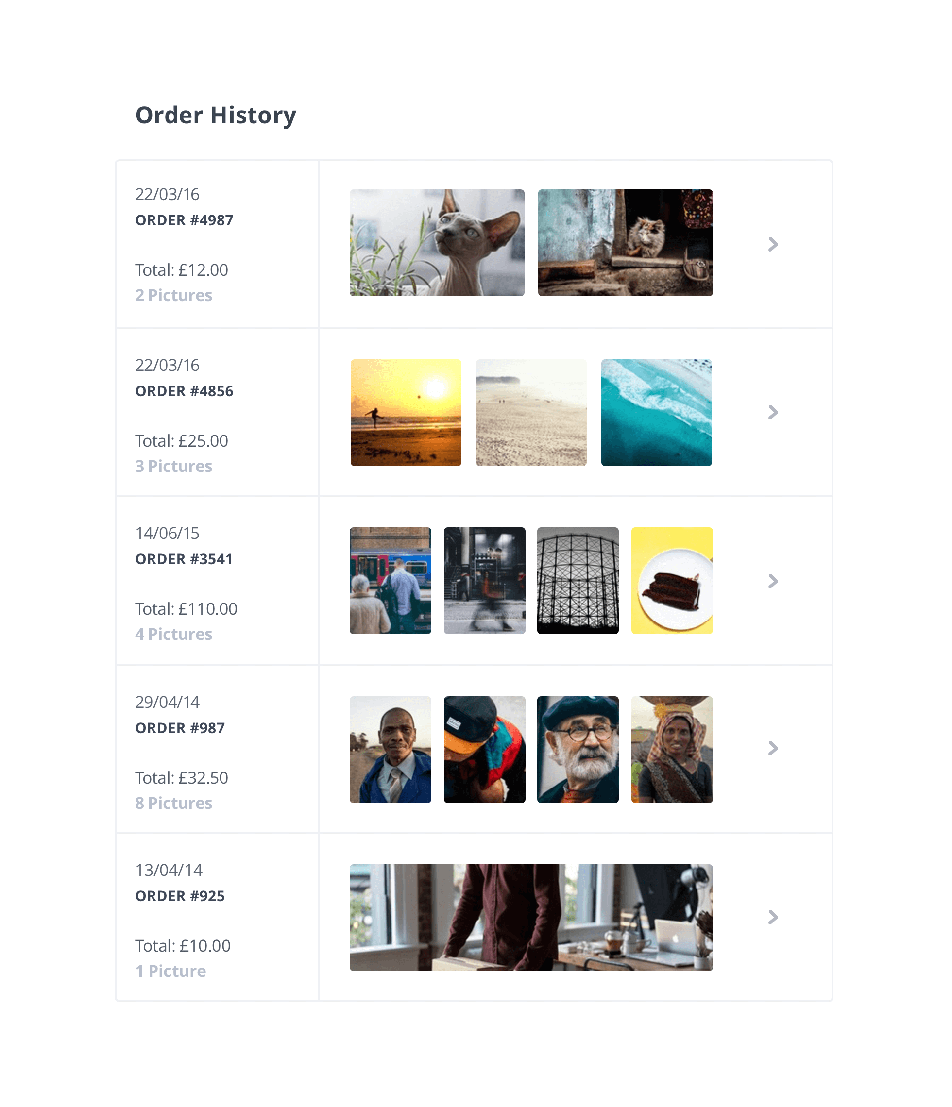
New Order History Page
We had recently implemented the ability for our customers to license multiple images in one order. However the design of our order history page at the time was not particularly suitable for this.
So with a few days to do so I was tasked to redesign and build a new version of it. One that better accommodated for the new behaviour.
Key Takeaways
Sometimes worse is better. While I would have liked to have done a better job here. It was clear to us that the old implementation was no longer a good experience for our customers. We needed to move quickly — and we did.
It’s always difficult to release work you’re not happy with, but I learned here that shipping good enough is often better than dwelling on perfect. Software is clay, not stone.
And Plenty of Other Stuff
From minor UX changes to shipping a new FAQ page there was a lot of other things that I was fortunate enough to work on at Picfair.
We were also given a lot of freedom to explore and prototype in our 20% time. A few of the things I prototyped were: a completely new interactive homepage, a new design for our blog and an algorithmic cropping solution that generated better thumbnails for us (most of the time!).